

Farrow & Ball New 2016 Colours
Today I saw all the large samples of the new Farrow & Ball colors. There are some true gems!
Nestling seamlessly into the Farrow & Ball palette of 132 colours each of these new hues have been skilfully crafted by a small team of Farrow & Ball experts. Carefully chosen to refresh the Colour Card with pale neutrals, muted pastels and some vibrant brights to accent, our nine new colours are both a fitting tribute to our company’s rich heritage and a look to the future.
Discover the inspiration behind each colour and how you can make it work within your home.

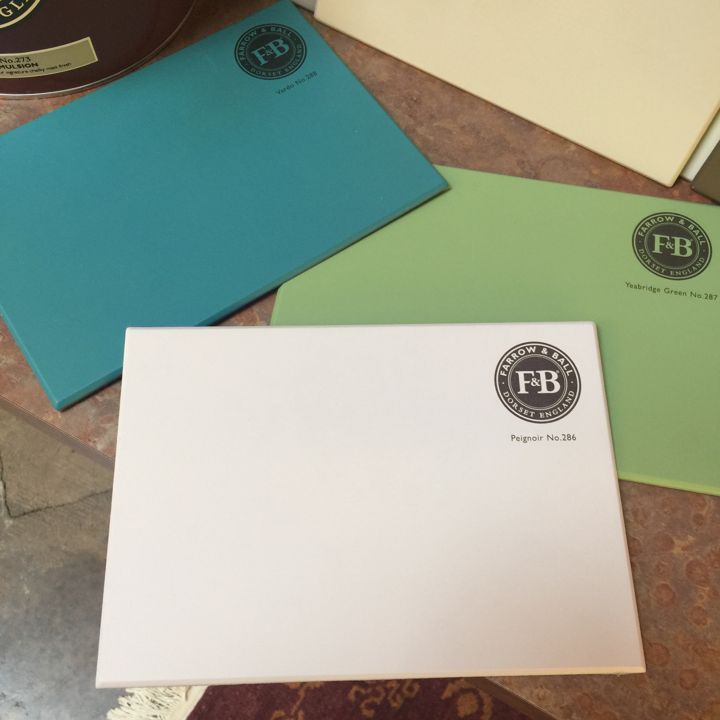
Shadow White is the lighter version of Shaded White so the two are linked and work perfectly together. Both names are taken from the soft tone created when whites are covered in a deep shade.
With none of the perceived yellow of Slipper Satin or the grey of Ammonite, Shadow White will work perfectly in any style of home. This versatile colour is perfect when paired with both Shaded White and Drop Cloth, and creates beautifully understated rooms when used on ceilings or woodwork.
Use in south facing rooms to create the perfect soft ‘shaded’ feeling.

We’ve named this colour Drop Cloth in honour of all the painters and decorators who have worked with Farrow & Ball paints for so long, as it’s the traditional name for a dust sheet. The colour has a subtle touch of mystery about it.
Drop Cloth is a darker version of both Shaded White and Shadow White, acting as the strongest hue in the group to complete this trio of colours that work in any style of home to give a classic look. It reads neither too yellow nor too grey making it the perfect colour for those who are wary of the fashion for grey and avoid tones that are too cream.
For east facing rooms the colour will appear stronger in the morning, becoming a more muted tone as the day goes on.

Worsted -Taking its name from city suiting often made from flat woven fabric, and the sleepy Norfolk village where the yarn was originally created.
Worsted works very well as the stronger tone when paired with Wevet, Strong White or Cornforth White. A little darker than Purbeck Stone but not as strong as Mole’s Breath this hue works fabulously as a wall colour in its own right, or as the perfect background to be punctuated with clean accents.
In north facing rooms this hue will appear as a stronger and grittier grey.

The Shipping Forecast is very much part of the fabric of British life – warning all sailors about impending gales and wind. Cromarty’s name is taken from the Cromarty Firth estuary and conjures up visions of swirling mists.
Cromarty, the lightest colour in the Mizzle, Blue Gray and Pigeon family is pretty and its ease of use means that it can create the softest of rooms which are neither too blue nor too grey. It is the perfect tone for those who like to keep things soft and muted.
In west facing rooms the colour can change dramatically from neutral through to a fresher, warmer blue.

Chemise, Blazer and Babouche are all names of colours in our paint palette that have been inspired by pieces of clothing. So with that in mind, Peignoir is named after the sheer floaty garment traditionally worn by ladies while brushing their hair in the mid-20th century, perfectly summing up the romance of this hazy grey-pink.
Peignoir will create the most humble, blushing interior as it is the softest of pinks containing a great big dose of grey. Its romantic feel makes it an obvious bedroom choice for a traditional home but it will add a certain charm to any modern living area. It works perfectly in combination with any of the Contemporary Neutrals as well as with the stronger Brassica and Brinjal.
Feels contemporary and crisp when combined with All White in south facing rooms.
Trend watch: We’ve seen a movement towards neutrals with a hint of colour, very soft calming muted pastels.

This colour was found at Yeabridge House, an 18th century Georgian Hamstone farmhouse, when the original gun cupboard was removed. This vibrant verdant green had laid untouched for many years but was amazingly still reminiscent of the lush Somerset grass that surrounds the house.
Yeabridge Green is the cleanest, freshest and most uncomplicated of our greens creating uplifting interiors especially when used in combination with Stiffkey Blue. With less yellow than Churlish Green, but more than Breakfast Room Green, Yeabridge Green is a true avocado green.
If you’re decorating in a room with northern lighting this tone will give an earthier feeling green.
Trend watch: Ever growing in popularity are lush botanical greens.

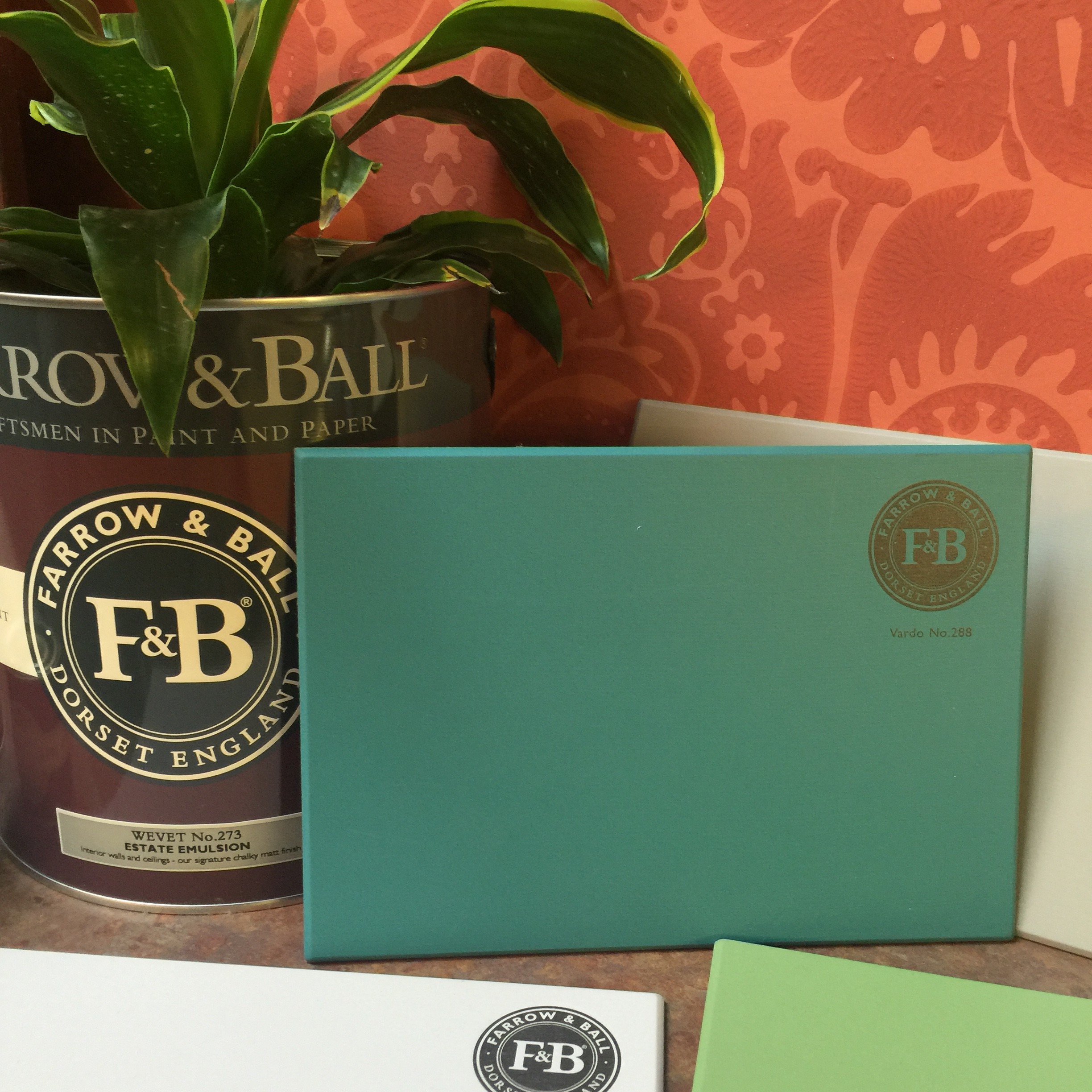
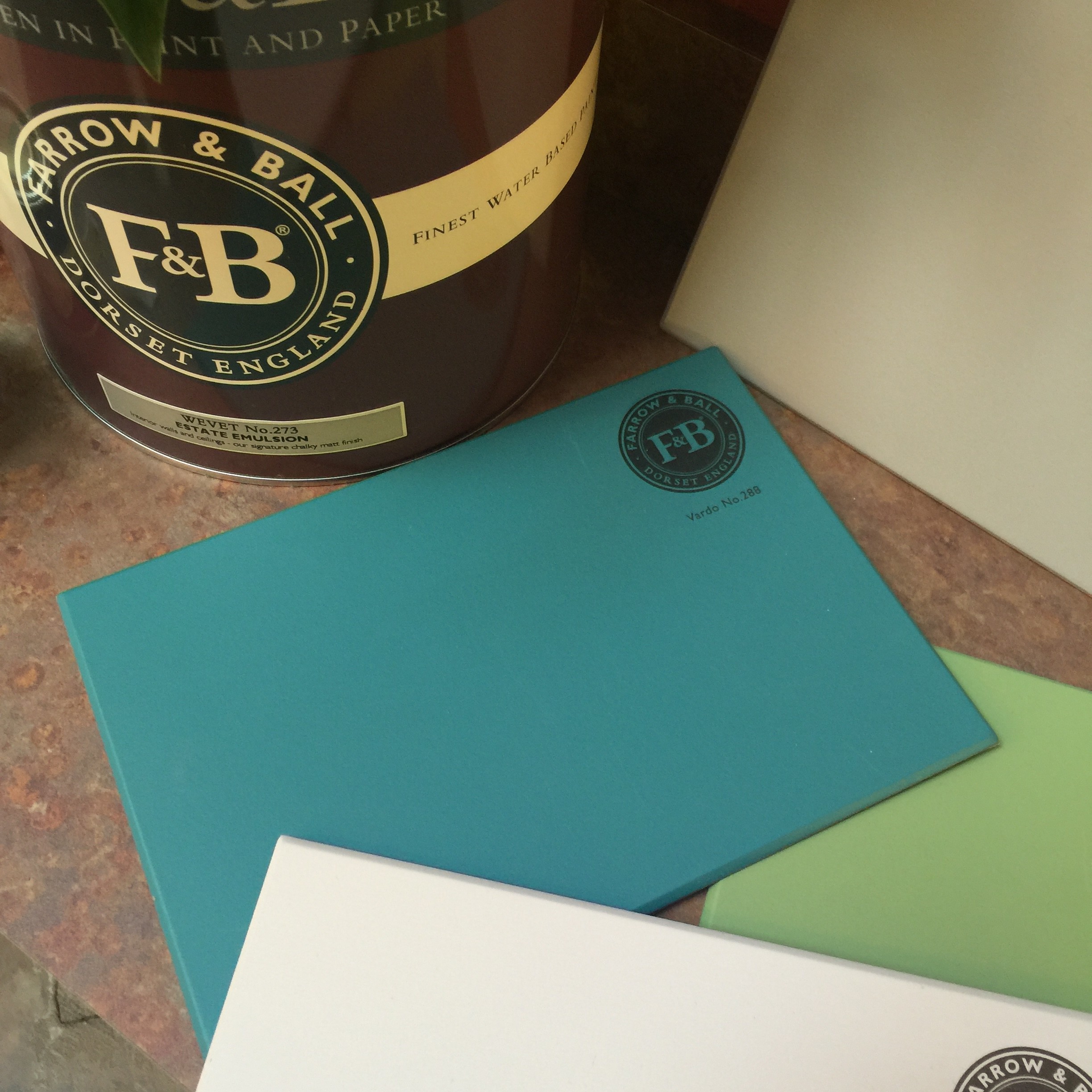
This colour seems so full of life and joy it seemed natural to name it after something which is known to have a flamboyant colour. A Vardo is a traditional horse drawn gypsy or Romany wagon. A similar colour was used in the intricate patterning of these showmen’s vehicles (usually over red) which is seen as an important cultural high point in decoration during the mid-19th century.
Vardo is an incredibly vibrant yet versatile colour that works so well with whites. It looks fantastically elegant when combined with the lighter Pavilion Gray and especially atmospheric with the darker Down Pipe.
Use in west facing rooms where the colour builds up throughout the day for a perfect glow in the evening.

Pronounced: with a ‘ch’ as in China, not a hard ‘c’ sound.
This is inspired by a bespoke colour made for Lord & Lady Inchyra at beautiful classic Georgian Inchyra House in Scotland. Inchyra Blue is used on the exterior doors of their very impressive byre (or barn) which was restored in 2013. It nestles at the bottom of a rather grey and imposing brae (or hill) so needed to have a depth to it but also be sympathetic to its dramatic backdrop and work with the moody Scottish skies.
Inchyra Blue, like many of our colours, is difficult to put in a box. To some it reads grey and to others green, but what is for certain is that it is the perfect alternative to charcoal for use on walls in contemporary homes. However, it is just at home on the exterior of traditional properties. Its uncertain colour creates an unmatched moodiness especially when combined with Black Blue or Vardo. For the less adventurous it also works perfectly with all the Architectural Neutrals.
In west facing rooms Inchyra Blue will look stronger and less coloured in the morning but become more blue as the day progresses.
Trend watch: This perfectly captures the ongoing popularity of dark tones on all four walls.

Salon Drab -This name goes right back to our roots, as does the colour. Room names have always proven to be popular choice for us and the use of the word Salon not only refers to the small outer room of a drawing room but also conjures up a cultural, intellectual conversational hub. A two-part name, combining Salon, the small outer room off a drawing room, with Drab, a term favoured by true colourists, which simply describes a colour as lacking in brightness.
A classic 19th century warm drab, this colour has been much requested and works perfectly with both the Yellow and Red Based Neutrals as well as with Skimming Stone. It is stronger and cleaner than Mouse’s Back and far less red than Mahogany. Its richness is extremely appealing and will create rooms that have mid-19th century authenticity despite being perceived as the perfect ‘chocolate’ for the modern home.
Perfect for darker north facing rooms to make them feel cocooning and cosy.
Trend watch: This perfectly captures the ongoing popularity for using dark tones on all four walls
Can you guess which is my favorite?
Vardo of course!
I NEED YOUR HELP!
I would like to ask a sincere favor, please vote for me in the Trad Home search for the “New Trads Rising Stars in Design.“

You can vote daily until March 15th and I would really appreciate if you popped over after you read my blog each day. It just takes a jiffy.
This opportunity would be a true design dream. There are so many talented designers and friends in the running. Be sure to check them out too.

Be sure to subscribe to THE ENGLISH ROOM for extra news, giveaways and discounts.
Let’s get friendly on Facebook, Twitter, Pinterest, Tumblr and Instagram.
Please feel free to contact The English Room if you are interested in our interior design services in Charlotte or beyond.

Sorry, the comment form is closed at this time.
Pingback: Paint GIVEAWAY with Farrow & Ball | The English Room
URL
… [Trackback]
[…] Read More: theenglishroom.biz/2016/02/11/farrow-ball-new-2016-colours/ […]
Pingback: Colour Schemes Bedroom - This Home Designs Ideas
Pingback: Bedroom Schemes - This Home Designs Ideas