House Tour: Mad for Bailey McCarthy’s Colorful Style
I am in LOVE with Bailey McCarthy’s color and pattern punch in her Houston home via House Beautiful.
People who embrace living with color make me so happy.
Check it out….
“Slexy” Is the New Designer Buzzword You Should Absolutely Be Using
It’s a combination of sleek and sexy — just like this colorful Texas house.
Entrepreneur Bailey McCarthy learned some hard lessons from the two-year mega renovation of her Texas home, but the vivacious overhaul proves it was a labor of love.
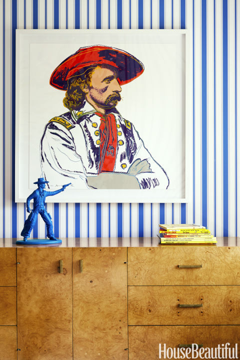
KATHLEEN RENDA: On a Venn diagram, this house would be the spot where extroverted overlaps with elegant.
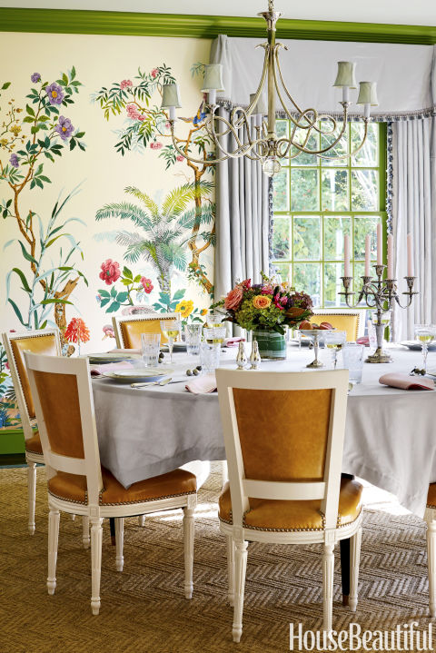
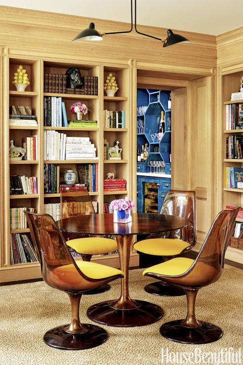
BAILEY McCARTHY: That’s where I was aiming! It’s a 1930s Colonial with a classic floor plan: entry and living room on the right, dining room on the left. I wanted the rooms to echo the home’s traditional character while also feeling fresh and fun. We have a five-year-old daughter and a three-year-old son, so it couldn’t be stuffy. I chose vibrant hues and whimsical patterns. The dining room’s fantastical wallpaper resembles a magical jungle in a children’s fairy tale. That pattern established the home’s style and palette of powder blues, moody greens and orangey reds with pops of pink.
You’re a cheerleader for color, as customers of your Biscuit Home bedding line and Houston shop well know. What drives that enthusiasm?
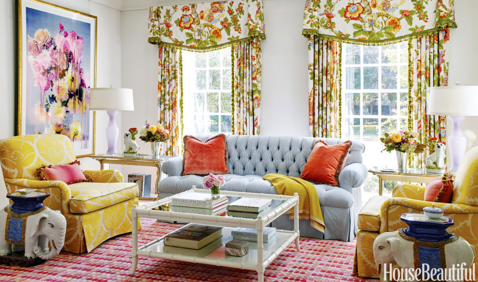
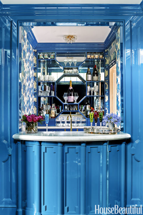
Nature plus nurture. I’m hardwired to prefer vivid hues. Growing up, I watched old-school musicals with elaborate sets like Willy Wonka & the Chocolate Factory — very psychedelic! Movies had a huge impact on me. I also don’t follow rules and have some kooky design inclinations. For example, my living room has a built-in bar in peacock blue, lemon-yellow chairs and lavender lamps.
Colorful, indeed. But then why paint the living room walls plain white?
Anything else would have distracted from the room’s artwork — a large-scale photograph of a floral bouquet that is literally dripping with color. Of course, me being me, I couldn’t do just white walls, so I had them lacquered to a high sheen, along with the ceiling, to reflect the room’s vibrant hues. Getting that shine just right is a multistep process, and I confess it didn’t go as planned. I could tell during the renovation that the lacquer wasn’t being applied correctly, but I was distracted by everything else that was happening and didn’t speak up. After we moved in, the paint started chipping and it had to be totally redone: a hard lesson learned.
How was the rest of the remodel?
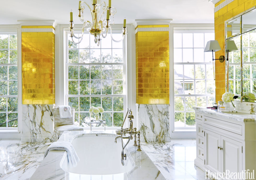
Like death by a thousand paper cuts. It took two-and-a-half years! When we bought the house, it was a complete time capsule. In its life, there had been only two previous owners, and everything needed updating, from wiring to ductwork and insulation. I kept the first floor mostly as is but gutted the kitchen. Upstairs, the biggest change was that we doubled the size of the master bathroom. The renovation took forever, but it allowed us to customize every inch. This is our fourth and final home, and I wanted it to be the culmination of all the best ideas I’ve tried over the years, plus some curveballs.
Like the gold tiles in the master bathroom?
I’ve always loved those glass gold-leaf tiles — they are so Liberace! — but this is the first time I’ve ever had a space that’s worthy of their blinged-out glam. By borrowing some square footage from the master bedroom, I was able to create a showstopper bath. Calacatta Gold marble and an antique Murano glass chandelier upped the ante. It may not be subtle but, as Diana Vreeland once said, “we all need a splash of bad taste.”
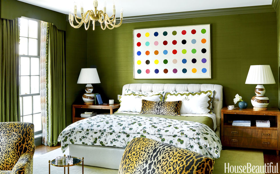
What was your strategy in the now-smaller master bedroom?
My buzzword was slexy — a combination of sleek and sexy. Any adornments are kept to a minimum. Most of the drama comes from an olive silk wallpaper that’s both subtle and rich. Aside from the metallic thread woven into the linen, the upholstered headboard is subdued, because I like to constantly change up the overall look with bedding from my shop. My current favorite is one of our floral patterns, which features painterly green blossoms that play off the wall color.
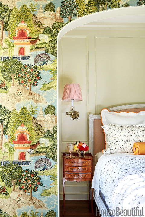
Any cautionary tales about mixing full-tilt colors and patterns?
Don’t attempt it when your creativity is at a low ebb. It’s better to just paint it all white and wait for inspiration — though I admit that I didn’t initially heed my own advice when I decorated our guest bedroom. I designed the first iteration at the end of the renovation, when I was feeling burned out. The results were ugly: The wallpaper looked anatomical, almost like veins, and the color scheme included dusty lilac and cobalt. I hated it, my husband hated it, our friends hated it. Finally I redid it all, this time with barely there green paint and chinoiserie wallpaper. It’s much more inviting now — but still adventurous!
This story originally appeared in the February 2017 issue of House Beautiful.
Be sure to subscribe to THE ENGLISH ROOM for extra news, giveaways and discounts.
Let’s get friendly on Facebook, Twitter, Pinterest, Tumblr & Instagram.
Please feel free to contact The English Room if you are interested in our interior design