

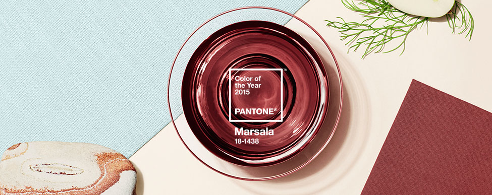
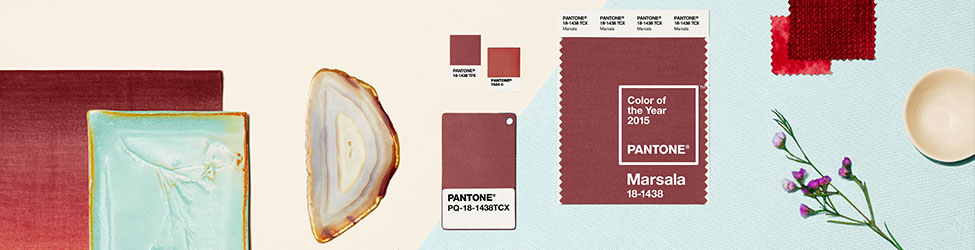
Pantone Color of the Year 2015: Marsala
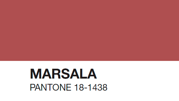
Pantone just announced the “Color of the Year 2015” and the winner is Marsala.
Much like the fortified wine that gives Marsala its name, this tasteful hue embodies the satisfying richness of a fulfilling meal while its grounding red-brown roots emanate a sophisticated, natural earthiness. This hearty, yet stylish tone is universally appealing and translates easily to fashion, beauty, industrial design, home furnishings and interiors.
The Versatility of Marsala
- Equally appealing to men and women, Marsala is a stirring and flavorful shade for apparel and accessories, one that encourages color creativity and experimentation
- Flattering against many skin tones, sultry and subtle Marsala is a great
go-to
color for beauty, providing enormous highlight for the cheek, and a captivating pop of color for nails, shadows lips and hair. - Dramatic and at the same time grounding, the rich and full-bodied red-brown Marsala brings color warmth into home interiors
- An earthy shade with a bit of sophistication, texture is the story in print and packaging. A matte finish highlights Marsala’s organic nature while adding a sheen conveys a completely different message of glamour and luxury.
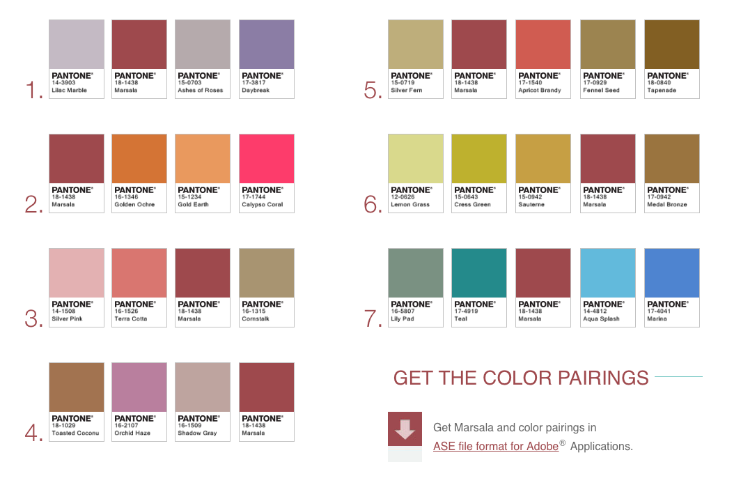
MARSALA COLOR PAIRINGS
Whether in a flat or textured material, or with a matte or gloss finish, this highly varietal shade combines dramatically with neutrals, including warmer taupes and grays. Because of its burnished undertones, sultry Marsala is highly compatible with amber, umber and golden yellows, greens in both turquoise and teal, and blues in the more vibrant range.
Marsala for Fashion
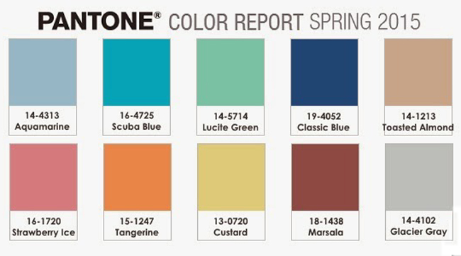
Marsala was a hit on the Spring 2015 runways with fashion designers featured in the PANTONE Fashion Color Report Spring 2015; Daniel Silverstain, Hervé Léger by Max Azria and Dennis Basso incorporated the hue into their collections. The impactful, full-bodied qualities of Marsala make for an elegant statement color when the color is used on its own or as a compelling accent when paired with many other colors.
With the ever-growing popularity of floral prints and striping, variations of this hue will undoubtedly carry into men’s and women’s clothing throughout next year. Marsala is also a popular choice for jewelry and fashion accessories, including handbags, hats, footwear and the burgeoning market of wearable technology.
This highly varietal shade combines dramatically with neutrals, including warmer taupes and grays. Because of its burnished undertones, sultry Marsala is highly compatible with amber, umber and golden yellows, greens in both turquoise and teal, and blues in the more vibrant range.
Marsala for Beauty
An incredibly versatile color for beauty, Marsala is an appealing and sophisticated shade that’s flattering against many skin tones.
Marsala pairs exquisitely with monochromatic mixes of peachy pinks, and sparkles against antiqued gold metallics, offering an assortment of lipstick and blush options. Marsala illuminates a range of smoky-neutral color combinations, making it a captivating eye shadow color that can be worn from morning until night. Add an overlay of bronze for a dramatic look that suits any eye color, or use Marsala as a go-to finishing touch on nails.
Marsala for Interiors
Complex and full-bodied without overpowering, Marsala provides a unifying element for interior spaces. Add elegance to any room by incorporating this rich and welcoming hue in accent pieces, accessories and paint. Marsala’s plush characteristics are enhanced when the color is applied to textured surfaces, making it an ideal choice for rugs and upholstered living room furniture.
Nurturing and fulfilling, Marsala is a natural fit for the kitchen and dining room – making it ideal for tabletop, small appliances and linens throughout the home. The hue will be especially prominent in striping and floral patterns found in printed placemats, dinnerware, bedding and throws.
Marsala for Graphic Design
A rich contrasting color, Marsala is ideal for use in graphic design and packaging. Eye-catching, but not overwhelming or bright, consumers are immediately drawn to the hue, making it an alluring shade at point-of-purchase. As packaging becomes increasingly more artistic, Marsala will be a natural fit for both high- and low-tech materials, including on-shelf periodicals as well as printed assets, like calendars and stationery.
About the PANTONE Color of the Year
The Color of the Year selection requires careful consideration and, to arrive at the selection, Pantone combs the world looking for color influences. This can include the fashion and entertainment industries – including films that are in production, the world of art, popular travel destinations and other socio-economic conditions. Influences may also stem from technology, the availability of new textures and effects that impact color, and even upcoming sports events that capture worldwide attention.
For 15 years, Pantone’s Color of the Year has influenced product development and purchasing decisions in multiple industries, including fashion, home and industrial design, as well as product packaging and graphic design. Past colors include:
- PANTONE 18-3224 Radiant Orchid (2014)
- PANTONE 17-5641 Emerald (2013)
- PANTONE 17-1463 Tangerine Tango (2012)
- PANTONE 18-2120 Honeysuckle (2011)
- PANTONE 15-5519 Turquoise (2010)
- PANTONE 14-0848 Mimosa (2009)
- PANTONE 18-3943 Blue Iris (2008)
- PANTONE 19-1557 Chili Pepper (2007)
- PANTONE 13-1106 Sand Dollar (2006)
- PANTONE 15-5217 Blue Turquoise (2005)
- PANTONE 17-1456 Tigerlily (2004)
- PANTONE 14-4811 Aqua Sky (2003)
- PANTONE 19-1664 True Red (2002)
- PANTONE 17-2031 Fuchsia Rose (2001)
- PANTONE 15-4020 Cerulean (2000)
Thoughts?
I must say…not my favorite but, I may change my tune… we shall see.
For gift ideas shop all my Holiday Gift Guides directly from my website home page. Go check out the drop drown menu for lots more guides. I will continually be adding items so check back often.
Happy Shopping and thank you for following along my daily musings.
Be sure to subscribe to THE ENGLISH ROOM for extra news, giveaways and discounts.
Let’s get friendly on Facebook, Twitter, Pinterest, Tumblr and Instagram.
Please feel free to contact The English Room if you are interested in our interior design services in Charlotte or beyond.
Sorry, the comment form is closed at this time.
Jeanne A.
This color could be OK in accessories, like pillows, but I can’t see it in large quantities in my home.
lesli devito
So VERY glad you came up with your own color! I may follow suit…I am not a fan of the ” Marsala” aka “Old blood” Pantone choice…wish I could know what they were thinking and where they were going with this one!!!
xo