Pantone Fashion Color Trend Report Spring 2018
I am so inspired and delighted by this Pantone trend report. I realize it is for fashion but home follows these very closely in terms on color trends. These 12 colors make me immensely happy.
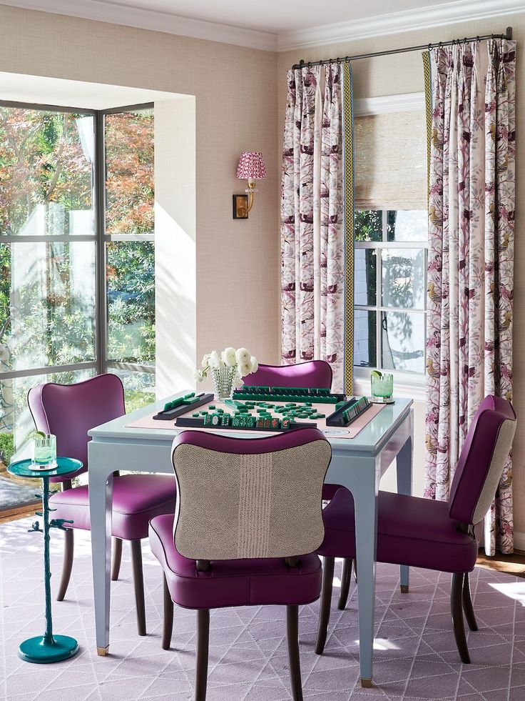
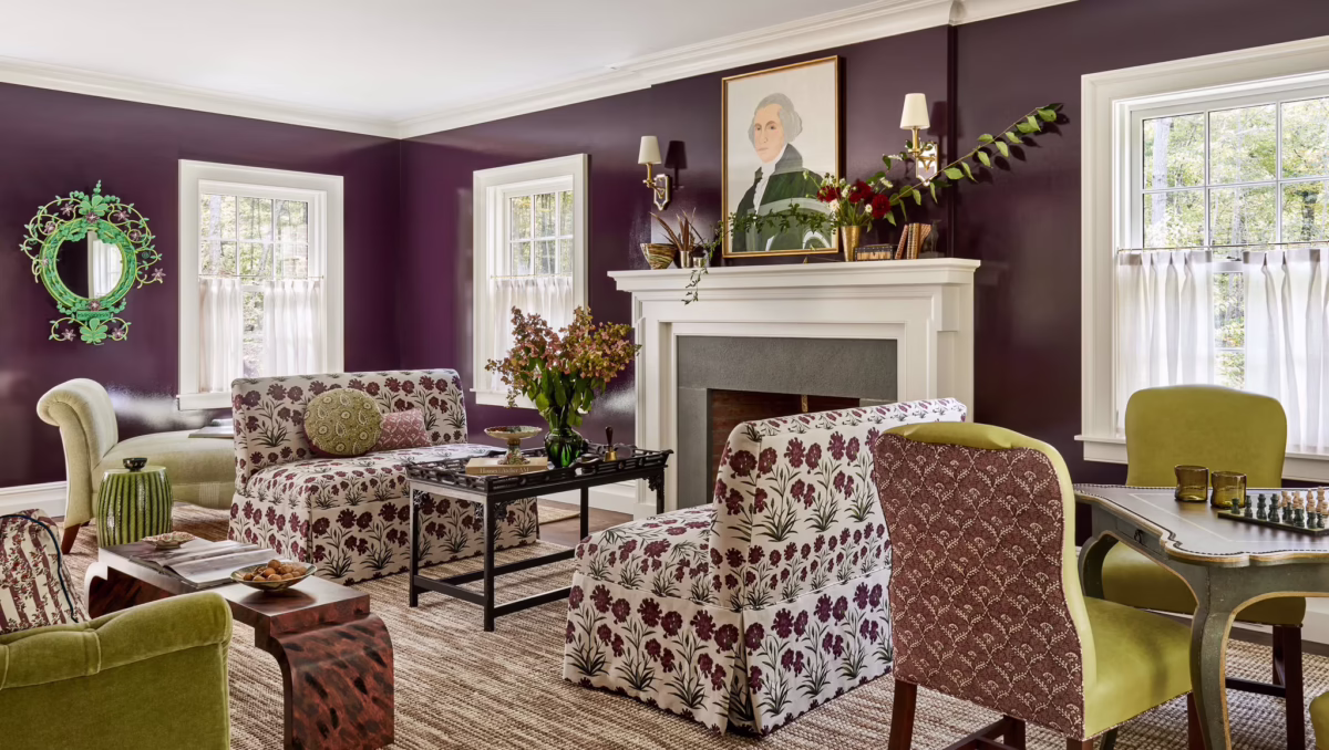
I am working on a hugely exciting project that I wil announce soon (fingers crossed) that will be full of bold color. These Clarence House prints are sure to be included and seem to encompass all the colors below.
Each season the team at the Pantone Color Institute creates the PANTONE Fashion Color Trend Report; a color overview highlighting the top colors fashion designers showing at NY Fashion Week will be featuring in their collections for the upcoming season. With color on the catwalk a key indicator of the color stories we can expect to see showing up across all areas of design, the PANTONE Fashion Color Trend Report is your easily accessible guide to the season’s most important color trends.
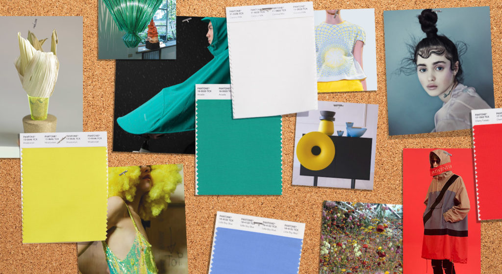
Color continues to be a powerhouse and a key influencer of fashion trends for Spring 2018. In response to the consumers continued embrace of color, designers are recognizing the need to show more color in their collections. Highlighting a more multi-faceted color story that expands the opportunity for self-expression, the PANTONE® Fashion Color Trend Report for Spring 2018 features the top 12 colors for men’s and women’s fashion. In another first, the PANTONE Fashion Color Trend report spotlights four classic colors, a family of color that transcends the seasons and provides structure to any wardrobe.
The desire for colorful self-expression is a key take away for Spring 2018. The color story is wildly divergent and we see a kaleidoscopic bounty of uplifting shades and feel-good tones. There is a feeling of optimism and confidence driving a new vitality into fashion trends. That doesn’t mean that we don’t continue to look for more neutral or classic shades as while simple, these core basics are seasonal essentials, working well on their own as well as providing the landscape for the color complexity.
Along with this recognized freedom to explore and experiment with more color, fashion, and the people who interact with it, no longer want to feel limited by traditional color guidelines. Gender and seasonal borders continue to be non-issues when it comes to color. Untypical spring shades that make for complex and original combinations, communicates the consumer’s desire to experiment with color all year round without any restrictions. The color story for Spring 2018 is a perfect reflection of this new sentiment.
About the Spring 2018 Top 12 Color Palette
The Spring 2018 palette encourages a sense of fun and playful release. With an air of complexity and distinctiveness, we find ourselves in a sanctuary of color that is ideal for some more unique and dramatic color mixing.
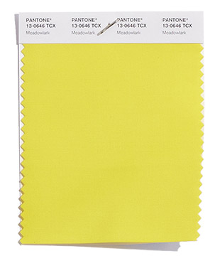
PANTONE 13-0646
Meadowlark
The bold and lively Meadowlark, a confident and outgoing bright yellow shade highlights the spring 2018 season, glistening with joy and illuminating the world around us.
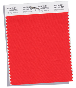
PANTONE 17-1563
Cherry Tomato
Impulsive Cherry Tomato is a tempestuous orangey red that exudes heat and energy. Demanding attention, this courageous, never to be ignored, shade is viscerally alive.
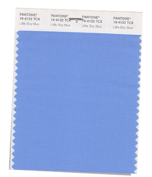
PANTONE 16-4132
Little Boy Blue
With the expectation of the clear blue sky, Little Boy Blue is no longer for little boys only. Suggestive of expansiveness and continuity, this azure blue shade reassures us with its promise of a new day.
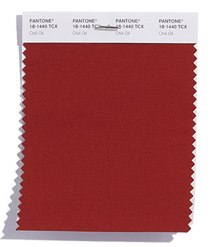
PANTONE 18-1440
Chili Oil
Seasoned yet season-less, Chili Oil is an earthy brown based red that adds flavorful definition to the spring 2018 palette.
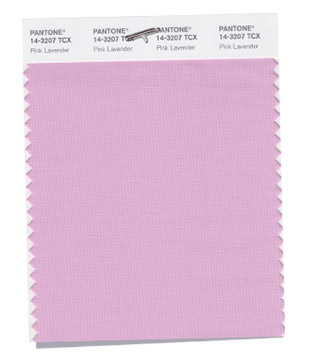
PANTONE 14-3207
Pink Lavender
Pink Lavender is a soft and romantic violet rose that charms with its soothing sense of quiescence.
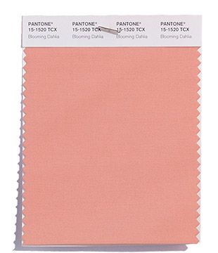
PANTONE 15-1520
Blooming Dahlia
With its seemingly suggestive scent, the subtly alluring Blooming Dahlia beckons us with its understated appeal.
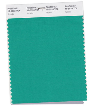
PANTONE 16-5533
Arcadia
Hinting at retro yet at the same time modern, Arcadia is a cooler, cleaner take on green that with its tinge of blue undertone takes us into a new direction for the spring 2018 season.
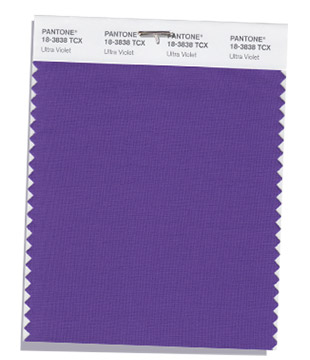
PANTONE 18-3838
Ultra Violet
Conveying originality and ingenuity, the magical Ultra Violet is a distinctive and complex purple shade that fascinates and intrigues.
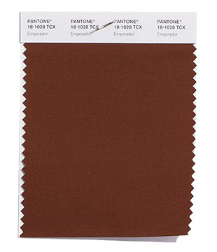
PANTONE 18-1028
Emperador
The rich chocolate infused brown Emperador adds strength and substance to the spring 2018 palette.
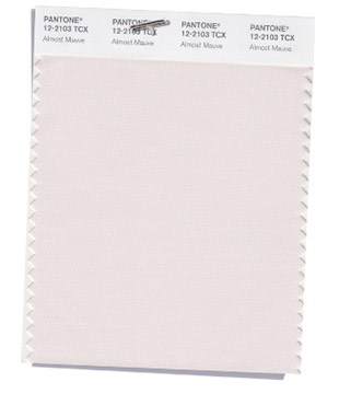
PANTONE 12-2103
Almost Mauve
With its gentle petal like touch, delicate and ephemeral Almost Mauve adds a sense of nostalgia to the spring 2018 palette.
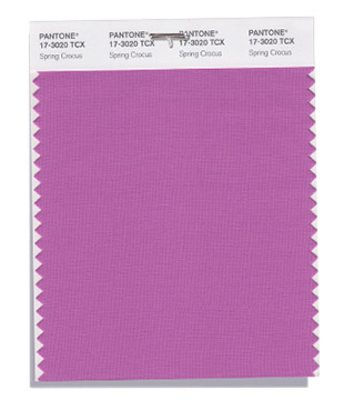
PANTONE 17-3020
Spring Crocus
Witty and expressive, Spring Crocus is a flamboyant and tantalizing fuchsia shade that summons you in with its beguiling charm.
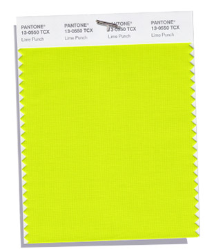
PANTONE 13-0550
Lime Punch
Sharp and pungent, Lime Punch hits a chord with its strident and striking citrus like presence in the spring 2018 color palette.
About the Spring 2018 Classic Color Palette
For many consumers, classic color is the mainstay of the wardrobe and the foundational core upon which they start building their own personal style. The core classic shades play a critical role in any wardrobe, and we wanted to highlight the nuance of these classic colors for the spring 2018 season.
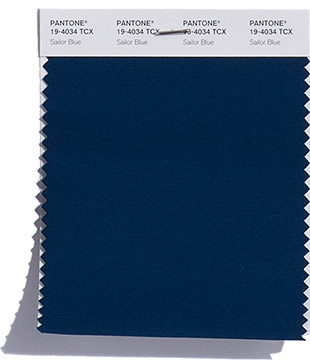
PANTONE 19-4034
Sailor Blue
The navy like Sailor Blue anchors the palette.
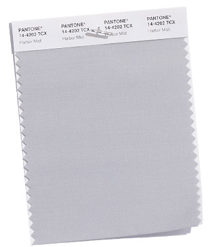
PANTONE 14-4202
Harbor Mist
A mid-tone dove gray; Harbor Mist solidifies the spring 2018 palette.
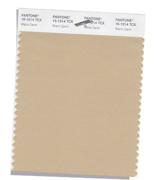
PANTONE 15-1214
Warm Sand
Warm Sand is a comforting neutral shade that effortlessly connects the seasons.
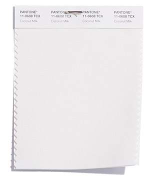
PANTONE 11-0608
Coconut Milk
Coconut Milk represents the classic mainstay of a white and/or off-white for the spring 2018 season.
Be sure to subscribe to THE ENGLISH ROOM for extra news, giveaways and discounts.
Let’s get friendly on Facebook, Twitter, Pinterest, Tumblr & Instagram.
Please feel free to contact The English Room if you are interested in our interior design services.